Website UX (user experience) is paramount for success — for search engine optimization, high conversion rates, and building all-around rapport and trust with your desired customer base. Website UX that showcases relevant and engaging content, has effortless readability and navigation, and contains fun/rewarding interactive elements is bound to boost conversion rates. Unless, of course, the website isn't mobile-friendly.
UX Web Design: Consider the user and the device
According to Pew Research Center, 97% of today’s Americans own a smartphone (up from 35% in 2011), 77% own a laptop or desktop computer, and 53% own a tablet. It follows, then, that the majority of Americans access the Internet — and your website — through multiple devices. So while your target user might ultimately be the same person, their behavior may vary drastically depending on the device they're using.
There are two ways to account for this when formulating your UX web design strategy.
- A responsive design, which adaptively scales itself for a consistent display across all devices. While this may save time and money upfront, it is a bit of a compromise.
- A mobile-optimized design, a slimmed-down, streamlined version of your website that caters to the unique needs of the increasingly important mobile user. In 2022, it was determined that 52% of all global internet traffic comes from a mobile device (TheGlobalStatistics).
In response to this shift, Google defaulted to mobile-first indexing in July 2019 — meaning that the mobile version of new or previously unindexed websites is given preference over the desktop version in tabulating search rankings. As such, mobile website UX is more of a priority than ever before. With a general understanding of the mobile user’s mentality and needs, we can provide a better mobile user experience.

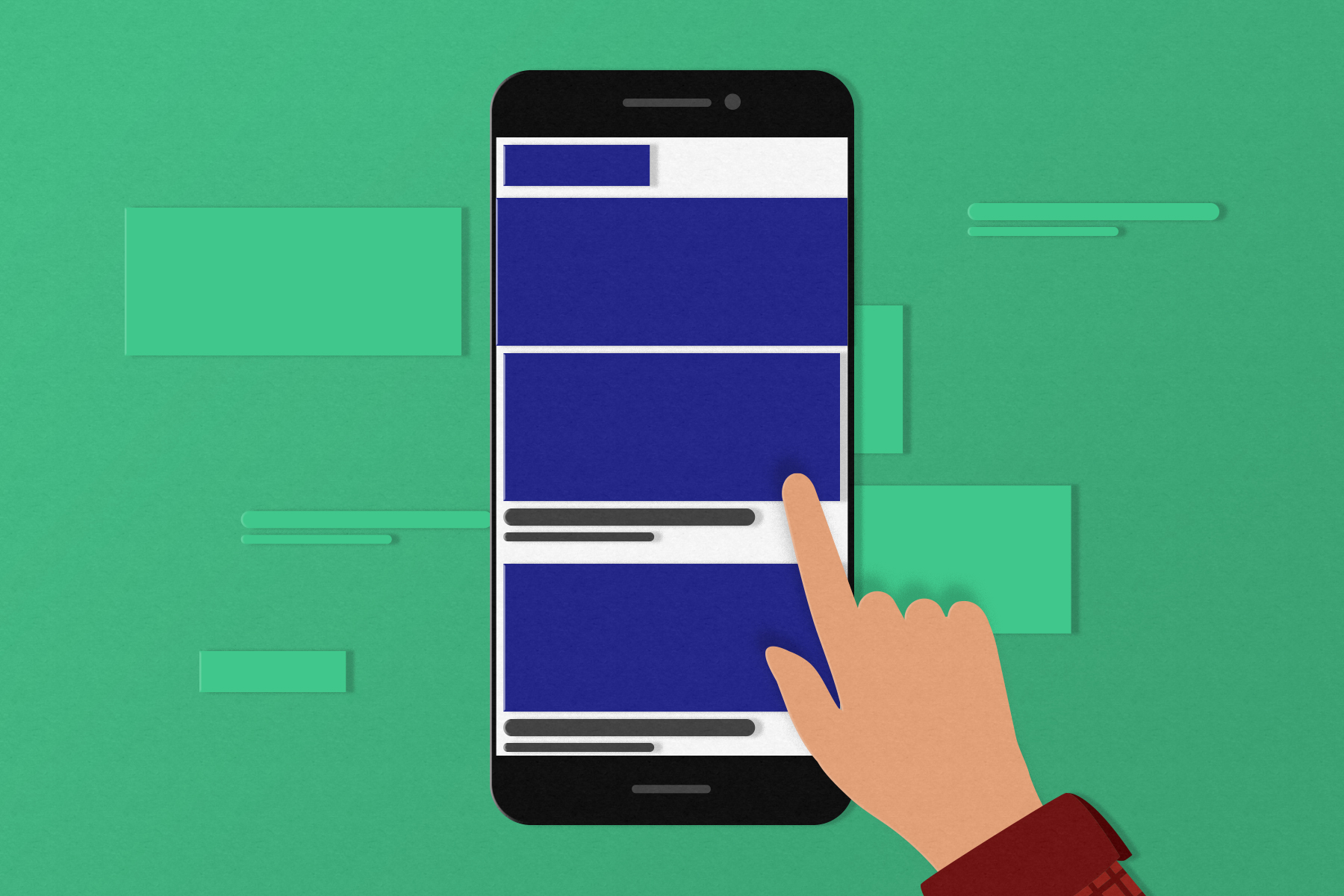
Mobile website UX accommodates motion
Your mobile site should adapt to people on the move by:
- Cutting load times: Although load speed is critical on any device, it’s even more crucial on mobile browsers where network connections may be spotty. Developers should keep coding as lean as possible while resisting the urge to add too many multimedia "bells and whistles".
- Utilizing a "less-is-more" approach with content and graphic design: Be you and be on-brand, but get your point across quickly. Your message and identity should be discernible at a glance. Graphically, page elements and fonts should be large, clean, and high-contrast. Users should never have to pinch or zoom to see something.
- Cooling it with the forms: It’s challenging to walk and type at the same time, although people certainly try. If you need to retrieve information from them with a form, do it in as few fields as possible. Bonus points if they are set up for auto-fill or auto-completion. (SIDENOTE: Never be pushy about obtaining information; use perks like discounts, free gifts, or complimentary trials as a show of good faith).
Mobile website UX is goal-oriented
UX web design cuts to the chase, getting visitors where they want to go in the fewest possible steps. Facilitate this by:
- Positioning the most important page elements “above the fold”: Your website’s primary calls-to-action (most directly related to your business goals) and functionality should be visible and easily tappable at first sight — without scrolling. Especially on the homepage.
- Streamlining navigation and user flow: Users should not feel as if they are fighting upstream to sign up for your service or buy your product. Make their goals fulfillable in the minimum amount of steps, and the process of getting there obvious with visual cues and reminders. Also, ensure that is impossible to get lost with a tappable logo (leading back to the homepage) and a hamburger menu (leading to the subpages) in opposite corners at the top.
- Bold CTAs: Call to action (CTA) buttons should be concise and forthright — instead of having visitors “learn more” about your business, product, or service (implying more reading and more steps), have them “find nearest location” or “get started” so they can be on their way immediately. Furthermore, the button should stand out from the rest of the content with a bright, inviting color.
Mobile website UX accounts for distraction
While a desktop or tablet user is certainly prone to distraction, they’re usually stationary or in a more static environment and likely to return. Conversely, mobile users could be anywhere doing anything, so a distraction like an incoming call or running into an acquaintance could be fatal to conversion. As such, your mobile site should provide users with the option to resume their sign-up or purchase later on any device (such as that desktop at home after the kids have gone to bed and it’s less chaotic), whether through e-mailing themselves a reminder with the appropriate link or bookmarking on social media.
At the end of the day, website UX should be treated as a cross-platform endeavor.

Your best website on any device
At Epic Web Studios, we take a mobile-first approach when it comes to UX and design, starting with the mobile-friendly configurations before working our way up. Our talented team of developers and designers build quality, high-converting website user experiences scaled to fit any device. Contact us to bring your web presence into the next generation.