
The Challenge:
A Public Resource that the Public Couldn't Use
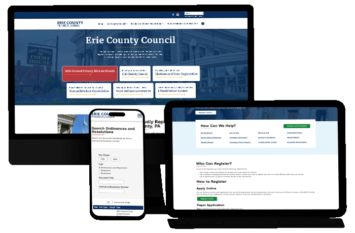
When Erie County Council came to Epic Web Studios in 2025, their existing website was working against the very people it was built to serve. Information was buried behind too many clicks. Navigation was unintuitive. Finding something as routine as a polling place or a meeting record meant digging through a structure that made sense to almost no one.
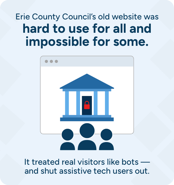
The most serious flaw went well beyond inconvenience. After a certain number of clicks, the old site would lock users out of content — effectively treating engaged residents as bot traffic. For a governing body whose legitimacy depends on public access and transparency, a website that turns citizens away is more than a usability problem. It quietly erodes trust.
Three groups were being failed at the same time:
- Residents looking for practical, day-to-day information could not find it.
- Citizens seeking transparency into how the Council operates were left in the dark.
- Community members trying to exercise their civic rights found the website a hindrance more than the help.
The Solution
Creating a Genuine Asset for Erie County Citizens
Council’s directive was direct: build a site that is easy to read, easy to navigate, and a genuine asset to Erie County citizens. We organized every decision around three civic outcomes — utility (find a polling place or meeting recording in seconds), transparency (logically organized, searchable records of meetings, ordinances, and resolutions), and civic agency (clear paths to participate in local government). The work unfolded in two phases.
PHASE ONE
A Foundation Built on Clarity
- Directory-style navigation. We restructured the site around its three core departments – County Council, Elections and Voter Registration, and the Human Relations Committee – using clear, hierarchical, directory-style menus. Residents reach what they need in fewer clicks, and breadcrumbs plus quick-navigation submenus keep users oriented at every level, so no one feels lost in the deeper pages.
- Typography chosen for legibility. We set the body copy in Inclusive Sans – a typeface designed specifically for readability and accessibility, with clear, unambiguous letterforms and no decorative impostors to slow readers down.
- A WCAG-compliant color system. We built a restrained palette with contrast verified for compliance: a deep navy primary, a gold secondary, and a green tertiary, each paired with foreground colors that meet accessibility contrast standards.
- Multilingual access. We implemented Google Translate so residents who speak English as a second language can engage with public information in a language they’re comfortable with.
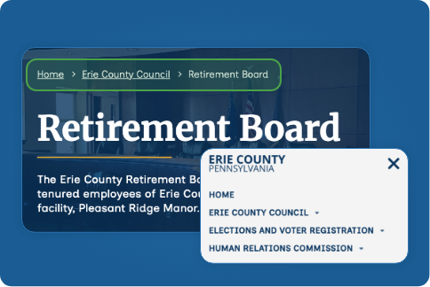
Breadcrumbs and directory-style navigation helped to reduce clicks and orient the user to their place within the site.
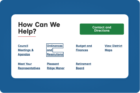
Keyboard focus indicators help users keep track of their place on the page.
PHASE TWO
Hardening for Assistive Technology
A year after launch, Epic’s development team returned to elevate the site from compliant to genuinely robust for users of assistive technology. The work included:
- Keyboard focus indicators, restored site-wide. The single largest issue we addressed. Users navigating without a mouse can now clearly see their location on the page at all times.
- Stronger screen reader support. We corrected table headers, navigation labels, heading structure, and link descriptions so assistive technologies interpret and announce content accurately.
- Fully navigable by keyboard. We fixed keyboard navigation so users can tab through the entire page naturally – including footer sections – without getting stuck in a trap.
- Descriptive link context. Every “Read More,” “View,” and “Learn More” link now carries descriptive context, so screen reader users know exactly where a link leads before they follow it.
- A working “Skip to Content” link. Keyboard users can now bypass the navigation and jump straight to the main content of any page.
- Structural fixes across 42 files. We applied proper ARIA roles, semantic headings, and expanded abbreviations for screen readers throughout the site.
The Result:
Accessibility Exceeding Industry Standards
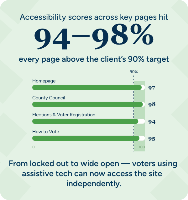
The site now scores well above Council’s 90% target on automated accessibility checks:
|
Page |
Accessibility Score |
|---|---|
|
Homepage |
97 / 100 |
|
County Council |
98 / 100 |
|
Elections & Voter Registration |
94 / 100 |
|
How to Vote |
95 / 100 |
Beyond automated scoring, the site passes WAVE — an industry-standard accessibility checker — with zero errors and zero contrast errors across all tested pages.
What this means for residents
For a government website, accessibility is not a finishing touch — it is the baseline of equal access to public services. The rebuild turned each of Council’s three goals into something residents can actually feel:
- A resident using a screen reader can now find their polling place independently.
- A keyboard-only user can move through the entire meeting and records archive without hitting a dead end.
- A resident who reads in another language can access the same public information as everyone else.
That is what transparency looks like in practice — not a promise on paper, but a website that works for the whole community.
I think you all did an amazing job with the voter's website. It appears to be very easy to navigate as well as informative
Websites for Everyone
Epic Web Studios builds websites that meet the highest standards of accessibility and usability — because the best digital experiences are the ones everyone can use.
Get Started